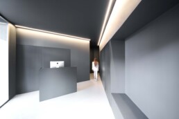
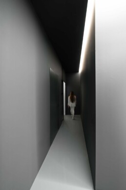
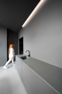
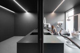
The irregular space is solved with the entrance hall, creating an interesting perception of space.
Located in the center of the city, the project arises to give response to a new clinic whose values are based on an extremely personalized treatment to the client. The layout of the building, which dates from the beginning of the last century, conditioned the distribution.
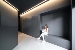
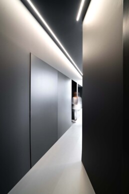
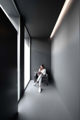
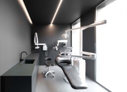
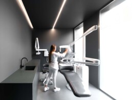
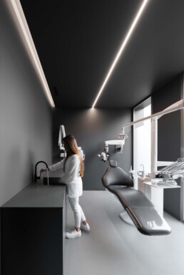
It was decided to unify the color of walls, floor and ceiling, using a continuous pavement designed by the studio.
The tone of this material is applied to the lacquering of the wooden panels and the painting of the walls, to the solid surface of the counter tops, to the faucets, the push-buttons … etc. favoring an environment that responded to the idea of the owners.
This dark gray tone intentionally contrasts with the necessary dental care devices, which are shown this way as the main elements of the activity.
The irregular space is solved with the entrance hall, creating an interesting perception of space.


